


Graphic Design in the Development World: It’s All about the Details
![]() In my years of designing graphics in the development world, I believe that on-the-job experience is far more important than just having the title Graphic Designer. In my own expression of the field, graphic design is the art of communicating with images or text (graphics) by arranging (design) them in such a way that they give an alluring vibe to any written or verbal content.
In my years of designing graphics in the development world, I believe that on-the-job experience is far more important than just having the title Graphic Designer. In my own expression of the field, graphic design is the art of communicating with images or text (graphics) by arranging (design) them in such a way that they give an alluring vibe to any written or verbal content.
In the development world, the art of arranging text and images in an artistic manner can convey the intended message in one glance. Unlike traditional art, which involves the artist expressing their personality in their art for anyone with whom their work resonates, the graphic designer has to constantly look outside themselves. Since the designer’s art is created for public consumption, their content has to be based solely on what the target audience will relate to. That is why, especially for graphic design in development work, every little detail matters because there is so much to consider outside oneself.
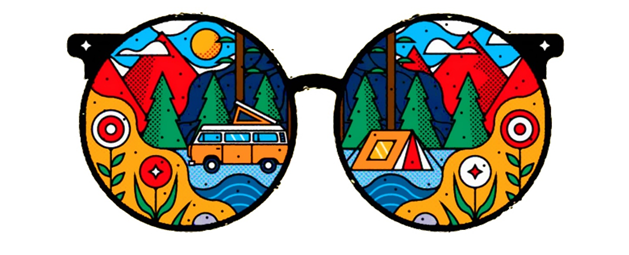
Over the years, I have found that most people respond faster to images than to a lot of words; hence, I prefer my designs to have more holistic images and few words. This can be a major advantage in design, as one image alone can speak volumes and perfectly deliver the message. However, this also posed a disadvantage for me in my first months in development design; that one image that speaks volumes can also be interpreted in many different ways. Depending on who is looking at it, it can have different meanings for different people.
![]()
![]() An example is the icon used to represent hospitals; this symbol is shaped in the form of a cross. The symbol used to represent churches is also shaped in the form of a cross. Designing health information, education, and communication (IEC) materials with a cross symbol that represents a hospital might attract a churchgoer who is not in the target audience because the cross symbol is relevant to them. However, a non-Christian who is in the target audience, seeing the same flyer, might have a bias toward the flyer because their religion doesn’t identify with the cross, so they ignore the flyer and thereby miss the whole message.
An example is the icon used to represent hospitals; this symbol is shaped in the form of a cross. The symbol used to represent churches is also shaped in the form of a cross. Designing health information, education, and communication (IEC) materials with a cross symbol that represents a hospital might attract a churchgoer who is not in the target audience because the cross symbol is relevant to them. However, a non-Christian who is in the target audience, seeing the same flyer, might have a bias toward the flyer because their religion doesn’t identify with the cross, so they ignore the flyer and thereby miss the whole message.
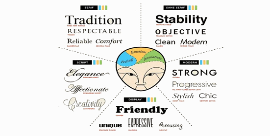
This is where studying your target audience plays a huge role in selecting the types of graphics used. Culture, demography, age, race, gender, religion, or even the social standing of your target audience should drive the type of design to be disseminated. Even the type of font matters! For instance if the age group of my target audience is between 5 years to 15 years old, using childlike graphics or cartoons might keep their attention and allow them to absorb the message. Using adult characters might seem too serious and result in the target audience ignoring the message.
 Color, I’ve also come to experience, is a huge factor to consider in designing for a diverse target audience. I once went to a health-themed conference where one of the stands had IEC materials on breast cancer. Their flyers, and basically all their merchandise, were pink. Because pink is perceived as a feminine color, the stand attracted a lot of women, who picked up flyers and perused their content. You can say this was successful marketing, as women were their major target audience—but I didn’t see it that way. The fact that no male conference attendee approached the stand, even though one of the stand attendants was male, tells me that they missed an important opportunity. Women are far more susceptible to breast cancer, but by directing their materials only to female audiences, that organization made it gender restrictive. By doing that they lost out on educating the countless men with wives, sisters, mothers, daughters and even friends.
The experiences I shared above and countless others have shaped me as a graphic designer in the development world. They have guided me, not only in making visually appealing content, but also in disseminating relevant information in the best manner possible, to diverse audiences. It’s all about the details.
ABOUT THE AUTHOR

Husseina Bakori has eight years of experience in communication. As a development worker, she has provided communication support to the UNICEF Reading and Numeracy Activity Project (RANA), the Sickle Cell Aid Foundation (SCAF) and the Institute for Humanitarian Studies and Development (IHSD). She brings expertise in graphics design, creative writing, website and social media management.

Thank you for this thoughtful blog, Husseina. Nice piece about designing with the audience in mind! The examples illustrate your points very well, too. (Sorry for the pun.)
This was a great share.Its even more profound from a fellow designer in the development world. I like your emphasis that its all about details and i thinks that’s the “eye” that designers are gifted with. Details! Not just of the work but the audience, the message, the format and most importantly how it will be received/perceived.
I think one of the interesting challenges of design in development is always about collaborations. Especially with the (intended) audience.as a designer we know this principle of co-creating or pre-testing or brainstorming. However in the development area, this tends to be not straightforward. Because “we know who the audience is and have made attempts to put ourselves in their shoes”. Your pink flier example really puts that into perspective. LOL!
Kudos
Hahaha, very true. Thank you Collins.
Thanks Husseina for sharing and your points are valid.
Thank you Husseina for sharing this blog! You shared many important points that sometimes we call “considerations.” But that term is misleading. All of us in global health must be committed to inclusive designs. Every detail of our design is critical – sex, gender, skin color, facial features, hair texture, clothing, globe, currency, ability/disability, families, etc. Design details such as the location of the photo matching caption and what is in the background should also be considered. We should also be respectful about placing words and logos on people’s faces and across their bodies. All of these details expand the reach of our messages but also communicates our respect for diversity and inclusion.
This is a lot easier than done – for many of us who are accustomed to certain images or through our backgrounds have not had to confront diversity and inclusion often – we need easy to use tools, checklists, and time to reflect on an implicit messages.
Lastly, good design is important however, we also have to earn the trust of our peers, colleagues, and partners around the world. We have to reflect on our actions as well – how do we show up when we travel for technical assistance? What do we wear? What do we do and expect?
Inclusive design, transparent intent, and thoughtful action is what we need to do development differently. I hope others will share their comments and experiences. Thank you again!
Thank you Luis, your comment adds more life to my article, a broader perspective. I hope everyone who reads it would read your comment too.